RGB and CMYK color systems: Guide for designers and label makers
The RGB color model: Additive color for digital displays
What is RGB?
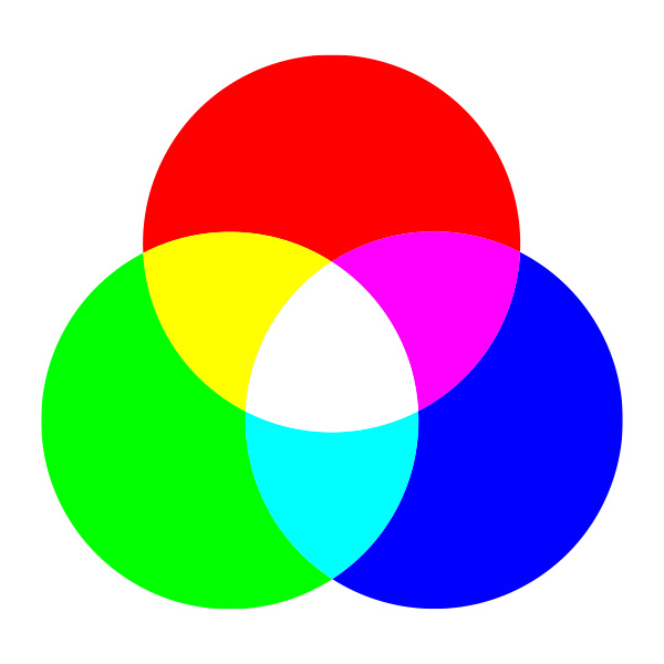
RGB stands for Red, Green, and Blue – the three primary colors of light. The RGB model is additive: colors are created by adding different intensities of red, green, and blue light. When all three are combined at full intensity, the result is white; when all are absent, the result is black.
How RGB works
Pixels and subpixels: Every digital screen (monitor, phone, TV) is made up of thousands or millions of pixels. Each pixel contains three subpixels—one red, one green, one blue.
Intensity Values: Each subpixel can be set to an intensity between 0 (off) and 255 (full brightness), allowing for over 16.7 million possible color combinations (256 × 256 × 256).
Additive Mixing: By varying the intensity of each subpixel, the screen can display a vast range of colors. For example: (255, 0, 0) = pure red (0, 255, 0) = pure green (0, 0, 255) = pure blue (255, 255, 0) = yellow (red + green) (255, 255, 255) = white (all at full intensity) (0, 0, 0) = black (all off)
Why is RGB used for screens?
Digital devices emit light directly, making the additive RGB model ideal. This model aligns with how our eyes perceive color, allowing screens to reproduce vibrant, saturated hues that are difficult or impossible to achieve with ink on paper.
RGB Color Gamut
Wide Gamut: RGB can display a broader range of colors (gamut) than CMYK, especially in bright, saturated tones like neon greens, blues, and magentas.
Device Dependence: The exact colors produced by a given RGB value can vary between devices due to differences in display technology, calibration, and color profiles.
Common RGB Applications
Web and app design
Digital photography and video
Social media graphics
Digital advertising
On-screen presentations
The CMYK Color Model: Subtractive color for print
What is CMYK?
CMYK stands for Cyan, Magenta, Yellow, and Key (Black). The CMYK model is subtractive: colors are created by subtracting (absorbing) certain wavelengths of light using inks or pigments, and reflecting others. When all inks are combined at full strength, the result is (theoretically) black; when none are present, the result is the white of the paper.
How CMYK works
Inks as Filters: Each ink absorbs its complementary color: Cyan absorbs red Magenta absorbs green Yellow absorbs blue
Subtractive Mixing: By layering these inks in varying percentages, printers can reproduce a wide range of colors. For example: Cyan + Yellow = Green (red and blue absorbed, green reflected) Magenta + Yellow = Red (green and blue absorbed, red reflected) Cyan + Magenta = Blue (red and green absorbed, blue reflected)
Black (K): In theory, combining 100% cyan, magenta, and yellow should produce black. In practice, due to ink impurities, this results in a muddy brown. Black ink (K) is added for depth, detail, and efficiency.
Why is CMYK used for print?
Printers cannot emit light; they rely on reflected light from paper. The subtractive CMYK model matches this process, making it the standard for all professional printing—labels, packaging, brochures, magazines, and more.
CMYK color gamut
Narrower Gamut: CMYK cannot reproduce all the colors visible on an RGB screen, especially bright neons and deep blues/greens.
Color Shifts: Colors that are out-of-gamut (not reproducible in CMYK) will be mapped to the closest printable equivalent, often resulting in duller or shifted hues.
Common CMYK applications
Product labels and packaging
Business cards, brochures, flyers
Magazines, books, newspapers
Posters, banners, signage
What is the difference between RGB and CMYK?
Feature
RGB
CMYK
Primary Colors
Red, Green, Blue
Cyan, Magenta, Yellow, Black
Used For
Digital screens
Printing (paper, packaging, etc.)
Color Mixing
Add light to create colors
Subtract light using inks
Starting Point
Black (no light)
White (paper)
Color Gamut
Wider, more vibrant
Narrower, less vibrant
File Formats
JPEG, PNG, GIF, SVG, PSD
PDF, AI, EPS, TIFF
Color Values
0–255 per channel
0–100% per ink
Output Device
Monitors, TVs, projectors
Printers, presses
Table explanation:
This table summarizes the fundamental distinctions between RGB and CMYK. RGB is optimized for digital displays, offering a broader and more vibrant color range. CMYK is tailored for print, using inks to subtract light and create color on physical substrates. The choice between these models directly impacts color accuracy and visual impact in your final product.
When to use RGB vs. CMYK: Practical guidance
Always match your color mode to your project’s final output. Starting in the wrong mode can lead to unexpected color shifts, dullness, or even costly reprints
Use RGB when:
Designing for digital screens (websites, apps, social media, digital ads)
Creating graphics, icons, or images that will only be viewed electronically
Preparing photos or videos for online use
Use CMYK when:
Designing anything that will be printed (labels, packaging, business cards, brochures, posters)
Preparing files for professional printing or manufacturing
Ensuring color accuracy and consistency in print
File formats and color modes in design software
RGB-friendly file formats
JPEG/JPG: Best for photographs and web images; balances quality and file size.
PNG: Supports transparency; ideal for web graphics, logos, and icons.
GIF: Used for simple animations and graphics with limited colors.
SVG: Scalable vector graphics for web and UI elements.
PSD: Adobe Photoshop’s native format; preserves layers and editing capabilities.
CMYK-friendly file formats
PDF Industry standard for print; preserves color profiles, vector/raster data, and layout.
AI: Adobe Illustrator’s native format; ideal for vector artwork and print design.
EPS: Widely compatible vector format; used for logos and illustrations.
TIFF: High-resolution, lossless format for images and photographs.
INDD: Adobe InDesign’s format for multi-page layouts.
Best practice:
For print projects, always export your final files in a print-ready format (PDF, AI, EPS, or TIFF) with embedded color profiles and appropriate bleed settings.
Common color issues and how to avoid them
Color shifts and out-of-gamut colors
Problem: Vibrant RGB colors (neons, deep blues, bright greens) may not be reproducible in CMYK. When converted, these colors can appear dull, muted, or drastically different in print
Solution: Use soft proofing in your design software to preview how colors will look in CMYK. Adjust colors manually to bring them within the printable gamut. For critical brand colors, consult Pantone or spot color systems.
File mode mismatches
Problem: Sending an RGB file to a printer will result in automatic conversion to CMYK, often with unpredictable results.
Solution: Convert your files to CMYK before sending them to print. This gives you control over color adjustments and ensures the closest match to your intended design.
Incorrect black usage
Problem: Using 100% black (K) alone can result in flat, grayish blacks in large areas.
Solution: Use “rich black” recipes (see image) for deep, saturated blacks in backgrounds or large text. Use pure K (100% black, 0% CMY) for small text to avoid registration issues.
Low-resolution images
Problem: Images below 300 DPI (dots per inch) may appear blurry or pixelated in print.
Solution: Use high-resolution images (at least 300 DPI) for all print projects. For logos and graphics, use vector formats whenever possible.
Missing bleed and safe zones
Problem: Designs without bleed may have white edges after trimming; important elements too close to the edge may be cut off.
Solution: Add at least 3mm (1/8 inch) bleed on all sides, and keep critical content within the safe zone (at least 3–4mm from the trim line).
Special printing techniques: metallics, spot colors and more
Metallics (gold, silver, bronze)
Standard CMYK inks cannot reproduce metallic effects.
Solution: Use special finishing techniques such as foil stamping, metallic inks, or digital embellishments. These require separate setup and may involve spot colors or custom dies.
Consult your printer: Discuss your vision early to determine the best approach and file preparation.
Spot colors and Pantone matching
Spot colorsare pre-mixed inks used for precise color matching, often specified using the Pantone Matching System (PMS).
Use cases: Brand colors, metallics, fluorescents, or colors outside the CMYK gamut.
How to set up: Define spot colors in your design software and communicate with your printer about their use.
Other finishing techniques
Spot UV:Adds a glossy, raised effect to specific areas for contrast and tactile appeal.
Embossing/Debossing: Creates raised or recessed designs for texture.
Lamination: Adds a protective layer (glossy or matte) for durability and finish.
Die-Cutting: Custom shapes for unique labels or packaging.
Tip: Supply embellishment elements as vector artwork on separate layers or spot color channels, and set them to overprint as required by your printer.
Design tips for labels and packaging
Start with the end in mind
Determine the final output: Will your label be printed digitally, offset, flexographically, or with special finishes?
Choose the right color mode: Start your design in CMYK if it’s destined for print.
Consult your printer or packaging manufacturer: Ask for templates, dielines, and technical specifications.
Optimize for print
Use high-resolution images: 300 DPI minimum for raster graphics.
Keep text legible: Use vector text and avoid small fonts for reversed-out (white on black) text.
Add bleed and safe zones: Prevent unwanted white edges and ensure critical content isn’t trimmed.
Use rich black for large areas: For deep, saturated blacks, use a rich black formula (e.g., C:60 M:40 Y:40 K:100). For small text, use pure K only.
Proof your design: Print a sample or request a hard proof to check color, registration, and finishing.
Color consistency
Use consistent color values: For brand colors, specify exact CMYK or Pantone values.
Avoid mixing different blacks: Use the same rich black formula throughout your design to prevent inconsistencies.
Calibrate your monitor: Regular calibration ensures what you see on screen is as close as possible to the printed result.
Preparing files for professional printing
Prepress Checklist
Color Mode: Convert all colors, images, and graphics to CMYK.
Resolution: Use 300 DPI for raster images; vector graphics for logos and text.
Bleed: Add at least 3mm (1/8 inch) bleed on all sides.
Safe Zone: Keep important elements at least 3–4mm inside the trim line.
Fonts: Outline or embed all fonts to prevent substitution.
Layers: Flatten unnecessary layers; keep embellishments on separate layers.
Images: All image layers need to be embedded (not linked).
File Format: Export as PDF/X-1a or PDF/X-4 with embedded color profiles.
Proofing: Request a hard proof for color-critical projects.
Rich Black: Use appropriate formulas for large black areas; pure K for small text.
Spot Colors: Define and name spot colors as required.
What difference do RGB or CMYK make to printed Labels?
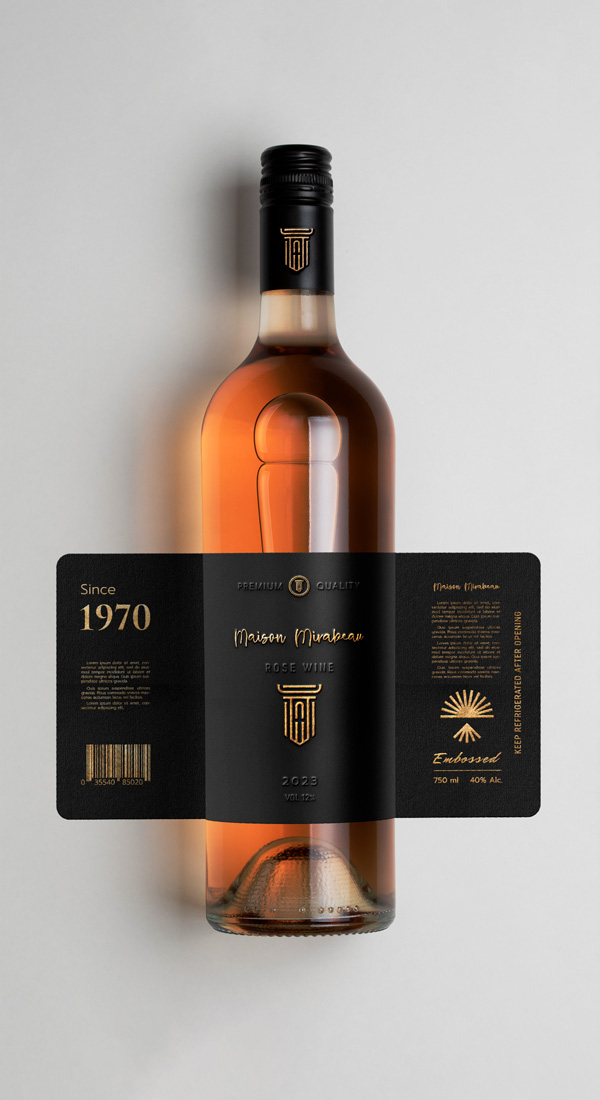
We’ve finally made it to labels, the main reason we are discussing different color models. When creating product labels, it is very important to pay attention to colors and design, because it will have a huge impact on the buyers’ decision whether to purchase the product. Obviously, label designers will use the CMYK color system when creating labels, but they’ll view them in RGB on their computer, so it’s important to see the final design in print version. Sometimes people want to see unusual or difficult-to-acquire colors on their labels, such as silver, bronze, gold. There are ways to achieve that using special finishing techniques, and that’s where experienced, professional label printers can really help.
Ensure your designs are prepared correctly
Check out our design services and get expert advice from a professional designer